
How much value you can get out your ERP system? It depends on how it is integrated with your business strategy and how it is being used to measure and improve the business process.
You have a strategy, a destination statement and probably a balanced scorecard. The next is about the execution and to keep on track of the goals set for financial, customer, internal business processes and learning and growth. Many times, you know what measure should look like and you know your ERP system has the data to feed to the measure. However, you could face challenges like being able to transform the data into useful information or distributing the information across the border of ERP. Here is where business partners like BTerrelll Group could step in and make you the hero by turning your idea into actionable dashboards and reports.
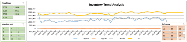
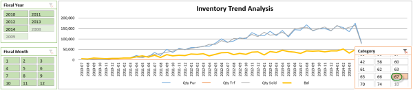
For instance, speaking of the improvement of the internal business process, here's one way that we can help Sage 300 ERP users using Power BI. Specifically, the following graph presents the inventory movement that helps to identify the overstock by category, item, product class, item-vendor, and location or any combination of these fields. The orange line below represents the inventory quantity balance, the blue line represents the purchase and gray is for sales. This shows that sales and purchases tracked each other pretty well, but the inventory appears overstocked across time. Digging further, when selecting category 67, as in the second graph, it shows the category start its inventory activities since 2010-07 and the purchase and sales keep growing, however, the inventory balance is managed at a relatively low level. So we learned it is well managed than other categories. And investigation can go on to help improve the business, actually the turnover calculated in another worksheet tells this as well.
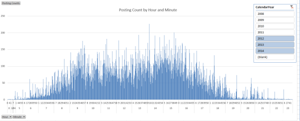
What else you can get out of Sage 300 ERP? The following graph shows the distribution of 60K+ G/L postings across a day in the past three years done by over 30 accountants. This information can be used to help to identify a better time window for things like data warehouse data refresh and backup.
Willing to turn your great idea into insight to your organization using the Power BI platform? Don't hesitate to contact the experts at BTerrell Group!

