
We all know the adage: being at the right time at the right place and with the right people is important to success. How do we translate this adage into the language of business intelligence? A good data model needs to have dimensions to represent time, location and people.
Power BI includes Power Map, a tool that helps address these requirements. Power Map can plot more than a million rows of data in 3-D, visually on Bing maps from an Excel worksheet table or the Data Model in Excel, and helps to gain new understandings by allowing you to visualize your data in geographic space and seeing time-stamped data change over time. As shown in the following example, as the time plays, the gallon quantity sold is plotted by location.
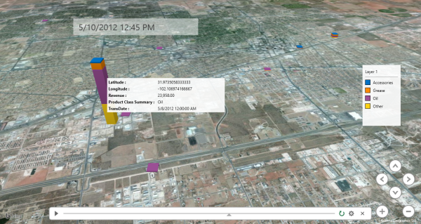
Last but not the least, Power Map helps to capture screenshots and build cinematic, guided video tours that can be shared broadly, engaging audiences like never before. Tours can be exported to video and shared that way as well. The following is an example that visualizes the quantity sold across the country and over time, by leveraging the time and location dimensions in the Power BI data model, connected with Sage 300 ERP data.
In summary, Power Map helps you to map data, discover insights and share stories in the dynamics of time and places.
Willing to turn your great idea into insight to your organization using the Power BI platform? Don't hesitate to contact the experts at BTerrell Group for help in making that happen!

